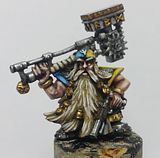
The pictures are a bit grainy, took them early this morning before heading off to the university, and the morning sun didn't agree completely with my camera, or the other way around.. Anyways, hope you can make out most of him - lovely sculpt, really fond of his pose!


Ooooh, I likez! Liker den slitte effekten du har fått til på våpenet. You rulz man.
ReplyDeleteHilsen Linn Beathe
Hehe, thanks LB! Glad you like him
ReplyDeleteHe has turned out as well as your last one. The fist is cool and the light splash on the front armour looks good - the rear I am not sold on - it looks good but not as good as the front. It looks a bit chalky - All I could suggest is maybe applying a glaze or light blue wash to try to tie/blend the colour progression better.
ReplyDeleteOr not.
Either way, the model is of a really high standard. Well done mate.
Thanks for the feedback Rogue Pom.
ReplyDeleteMyeah, I might try another glaze or something, will see if it helps.
I think Rogue Pom might be spot on with the glaze idea. Looks really good although I think the OSL might be a little off. I'm not certain but wouldn't some of the blue show up on the tasset on his left thigh? I'm not entirely sure on the theory behind it but I think it should be visible on all the surfaces that face the light source but not certain...?
ReplyDeletehttp://blog.brushthralls.com/?page_id=1916
Might be a useful link.
Anyway, the rest of the painting looks really great. I just think the powerfist looks slightly off. I love the way you've painted the gems and lens etc.
Thanks for the comment Elazar, glad to see you up and typing again.
ReplyDeleteMyea, I know the OSL got some flaws, think I'll repaint the areas red and start over again, and maybe increase the light radius... Thanks for the link, I did actually try to work out from it, but didn't get the same results, heh. Think I use too much paint on the brush when I glaze, and thus it tries chalky, read someplace else about drying off most of the glaze on a towel, then repeatedly glaze thin layers - I'll see if that works!
I've put Space Hulk on the shelf for the moment though, it's time to get those Dragon Ogres ready for some paint. Have to buy myself a drill and some thin wire for pinning though - will do that tomorrow! If all goes accordingg to plan, I'll have some WIP pictures of them tomorrow evening!