
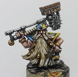
I've gone for what I believe must be a traditional Blood Angel theme: Armour's red, blood-drop gems will be red when I get to them, and chains and jewelry will be painted golden or brass (will save that discussion for further down). The battle damage will be something new for me to make, but I got some ideas as to how I'm to pull it off, and I'll probably add slightly more than what's sculpted into the model already. I was thinking of using the sword from Space Hulk's cover as inspiration for how I'm to paint the Lightning Claws; and with that in mind, I think that his eyes/goggles should be blue aswell. But how am I to paint the cables which protrude and connects arms and body? They're painted green on the box, but so's the eyes, and first of all I don't like the green colour they've used and secondly I don't think it'll fit my red and golden theme. So, any suggestions are very much welcome!
 Painting him red has taken some time though: I lost count of the number of layers I've given him, but I'm super happy with the results - hope you are too! I've gone from a Scab Red darkened with Chaos Black, adding more and more Scab Red for each layer, until I reached pure Scab Red, then it was Red Gore's turn to be mixed into it, then I slipped in more and more drops of Blood Red until finally I got to a final highlight on the edges with pure Blood Red. A lengthy process, but so much better than painting white, hehe! It's as if the red paint is more alive, and it's more easy to predict the outcome of each layer... On the other hand, maybe I'll slip in some of the painting-red-technique the next time I do a white horse, or some other part of my rather light Slaaneshi warband. One can always hope!
 Anyways, in a fit of madness, I've decided that I'm going to give the NMM-thingy a new chance. I must admit I was soundly defeated by the Stegadon earlier this year, but this time I got more time, and I've given it a shot on one of the skulls on Brother Claudio so far. I'm not perfectly happy with it yet, but it's better than what I ever managed on the Stegadon's gold. It doesn't shine enough yet, though...
I've been thinking, maybe I should try to make it more contrastful; darker shadow areas, and even a slightly lighter yellow for the areas of reflection? I also think it'd look better with a slightly warmer gold, but I don't know if adding some red paint into the browns and yellows I use, will give me what I want, or just mess it all up.
 Any tips are most welcome.
As a alternative though, if my NMM-plans goes to shit again, I do have some of that wonderful old Brazen Brass paint from GW, and I know from experience that it makes quite a good fit with red (Iiiiiih! Who'd thought Khorne would manage to infiltrate my Slaanesh-sacred blod?). So that'll be my back up plan *grins*
- - -
[Edit 16th of September]
I took some new pictures of Brother Claudio, and these pictures got a much better lighting than the ones I took prior to posting. I think these show the red colour more like it is, but I'll probaly add some extra highlights to the edges and such, when I find the time.

 The reason behind the little note with my name on and a date, is that I've decided to enter Jawaballs Blood Angels painting competition, just to prove it's my model, sort of.
Anyways, hope you like these extra pictures!


First things first. I really miss Brazen Brass. My first Slaaneshi Chaos army was all Midnight Blue and Brazen Brass based. Way back when though this was...
ReplyDeleteAnyhow, back on topic!
Your red looks lovely and deep, if I were you I'd maybe be tempted to do another edge highlight but adding a hint of Blazing Orange (I think that's the right colour) just to create a stronger contrast on the edge. However, it's not necessary but I reckon it would really make the red pop out.
See I'm a fan of the green for the eyes etc. Colour theory says that green is a good colour for red as they're contrasting colours on opposite sides of the wheel but blue can work well too.
Quite keen to see how the lightning claws look with the power sword blue effect.
I think you definitely need some greater contrast on the NMM, much like when you were working on the Stegadon though I can't be of much help there as it's something I still haven't tried let alone worked out so best of luck with it! What you've done looks shaded well but just doesn't seem gold enough if that makes sense. The theory is sound just the colour seems off but then that might just be the picture.
Claudio is still my favourite of the Marine minis, well except for the dead Marine on the throne, that's a wonderful sculpt and one I'm especially looking forward to painting myself... at some point... if I ever get around to it!
Myeah, I've beent hinking of adding one more highlight, but I want to wait 'til I've painted the rest, 'cos right now there's so much unpainted, which makes the model very much darker, so I want to have the gold and other metal parts, plus the gems done first, then I'll see if one last highlight is needed. Right now it's too dark to say. I don't have Blazing Orange, but I'll either buy it or mix myself something with one of my yellow paints.
ReplyDeleteI might give the green cables and eyes a try when I've finnished everything else, might be that it'll look good to my eyes aswell?
I'll try adding some more shade to the NMM, hopefully that'll give it the edge it need. I totally agree with you that it doesn't look gold enough yet.
The Space Hulk models are wonderfully detailed, so if you give them a try, I'm sure you can't pull yourself away from them until they're done, hehe. beware of some subtly mold lines - I discovered a couple a bit too late on Claudio and the Librarian, but they were easy enough to fix.
I think I agree with Elazar on the edge highlight - the flat colours look really well layered and maybe an extra edge highlight would give that little bit extra pizzaz.
ReplyDeleteOn the NMM front, I agree that you may need to add a little more contrast to 'brighten' the shine somewhat.
Like you have already mentioned though, this may just be because of how dark the model currently is and may not be needed when you finish off some of the other bits and pieces.
Looking good so far though.
The NMM needs crisper highlights. the shadows could go a bit deeper, but the reason it doesn't look like metal is because there's no shine there. you should have an almost yellow shin on the extreme reflection points.
ReplyDeleteDefinitely bring the red up more. Right now you've got a nice shade and base color going, but there's no real highlighting. Look at some nice red models online, and you'll see that you should have some of that orange highlighting, going as far as pure blazing orange at the extreme edges/corners.
Green lenses and gems for Blood Angels. The darker claws are fine with the green lenses and gems. for the cables, NMM steel.
Thanks for the comments and tips, Rogue Pom and AoM!
ReplyDeleteI'll keep on experimenting with my gold, and try to brighten it up more, and add darker colours to the shadows. Hopefully a light will go up for me in not too long time, heh.
Might be that I'll bow under for the "green is good"-warcry. A question to AoM, though: when you say green gems, does that include the blood-drop gems aswell? I figured they should be coloured red like, well blood-drop gems, but wil they just drown in the redness of the rest of the model, unless painted in a contrasting colour, is that it?
Brother Claudio will have to wait a bit though, as I've set myself a goal of having my Marauder Horsemen finnished by friday. I have painted the Slaanesh emblem onto the shoulderpad of the musican, and I think it looks good, so I'll probably settle for that when it comes to marking them.
Whew, long comment... Again, thanks for the comments and the critisism, it's really helping me turn to the brush when I got some time off from my studies!