
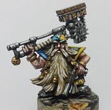
I've come to the point where the gems which adorn his armour need some loving from my brush, but I'm not sure in what colours I should paint them. As they're shaped like blood drops, I'd normally paint them red, but as most of the model's already painted red, I fear that gems might get lost, if painted red. Green was suggested earlier, as it is a complimentary colour to red, and thus makes for some nice contrasting work, but at the same time don't make the model look too "busy", if I've understood the theories of colour correctly. For that reason I finally buckled under pressure and made his eyelenses green instead of the blue colours I had planned. His eyes are quite small, though, so I've been deliberating whether or not I should paint them lighter, as they sort of disappear a bit, no? Take a look for yourself, and help me decide!
 Right, back to the gems. They're all encased in gold, and so I gave the red variant a chance, as I hope it'll set them apart from the rest of the armour. I did also paint one green gem, for comparison, but still I can't make up my mind, so I'll leave the choice up to you who might be reading this.
 One on each hand, if they're hard to spot. I'm not too happy with the green gem, think the red one looks more gem-like, and seems to be reflecting the light better, but might be related to the whole "painting green too dark"-issue I feel I have with the eyelenses. Anyways, what I'm trying to say is, don't pay heed to the fact that the red one might be a more successful attempt at painting gemstones, it's all about picking the colour.
Edit:
After painting his claws power-weapon-blue tonight, I've been thinking, maybe the model will become too busy with red, gold, blue and green; and while I think that red gems won't be visible enough, and therefore can be discounted as an option (unless someone manages to convince me otherwise), maybe blue gems would give the needed contrast to the red and gold, and at the same time fit in with the blue claws?
Any views/thoughts on this?


That is one of the sweetest pieces I have seen in a ong time - what a step forward since the last WIP shot. I was blown away how good he is looking.
ReplyDeleteFor the eyes, I might be tempted to hit the corners with a slihgtly lighter highlight - possibly up to straight white in the very corner if you have a steady enough hand.
As for the gems, I would go with the green like the lenses as a tie in colour - if you go red I don't think you will be able to differentiate enough from the armour and it may come across as looking unpainted - I would stay away from any more blue. I'm not sure if the picture has distorted it some what or if it is just the way the model has been molded but it sort of looks like the edge of the green gem on the right (or is that the left) fist is not straight which may be making it look odd.
The claws and your NMM look really good - have you taken the NMM highlights up again since the last post. The claws look great as they pull away from the body, creating different focus points, while still framing the centre of the model - drawing your eye to the NMM and central features of the model.
Awesome work mate.
Thanks for the long comment Rogue Pom!
ReplyDeleteI have made the NMM highlights much lighter, and the shadows slightly darker since the last WIP shot, using a Sakebite Leather/Chaos Black mix as the darkest shades, while a mix of Vomit Brown, Golden Yellow and Skull White have been my extreme highlights. In the WIP I used too much Vermin Brown, which made it too brown, I think... and the highlights weren't bright enough. Glad you like it!
You might be right regarding the green gem, his left hand is twisted a bit compared to the right with the red gem... I'll do a new green gem when I get the time, and I'll try to fix up on the eyes while I'm at it.
Just taking a break from my painting. I saw you'd updated on here and was just waiting for enough time to have a proper look.
ReplyDeleteIt's hard to add much to what Rogue Pom has said. This is looking phenomenal. You're entering it into Jawaball's competition aren't you? I'm entering my Brother Valencio (the chainfist marine) but will not be able to produce anything close to yours! This is an absolutely gorgeous mini! The NMM is looking awesome now and the Lightning Claws are stunning!
I'm still a fan of the green/red contrast regarding gems, eyelenses etc. The powerclaws will make a nice offset against those two colours and really do make the mini come alive. It's hard to write enough praise for this to be honest. Really great stuff!
Thanks for the praise Elazar! It means a lot!
ReplyDeleteHope to see some pictures of your Brother Valencio at your blog soon. And don't be dishearted, you're a great painter and I'm sure you'll come up with something really neat for your model, and snatch the first prize before everyone else!
I havn't been able to paint anything today, catched a cold or something, but hopefully I can get some more progress done after I've been off to study tomorrow. Looks like it's going to be green gems - will try to use lighter colours of green though, think it was too dark, the one I did.